MVA
Mikelić Vreš Architects
MVA has been creating contemporary architectural projects since 2007, covering all fields of architecture, from large-scale urbanism and public spaces to buildings of various typologies and scale. Their projects start from the context, both visible and invisible. Each is approached individually, structurally and analytically, solving the relevant issues through a teamwork process in a creative, affirmative and innovative way.
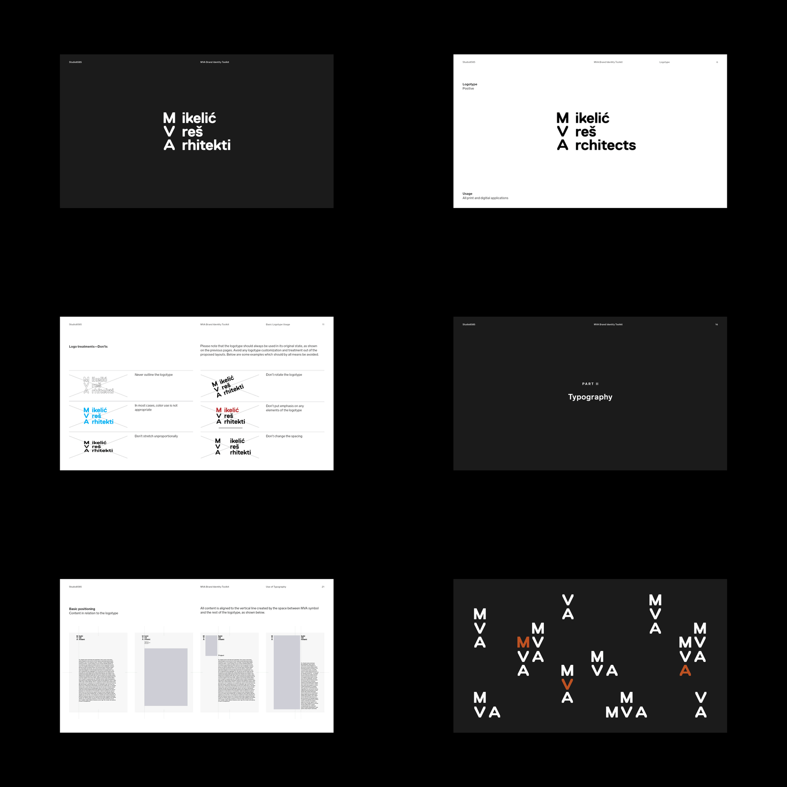
We wanted the brand identity to reflect those practices, starting with the heart of all architectural designs—the interaction with space. This undefined air between objects, combined with a rigorous topographic approach, is what we formed the identity around.
In the gap, many things can happen. The space in between is either left to signify the interaction between areas or is filled with content, dividing the main logotype into a symbol on one side and the typographic conclusion on the other.
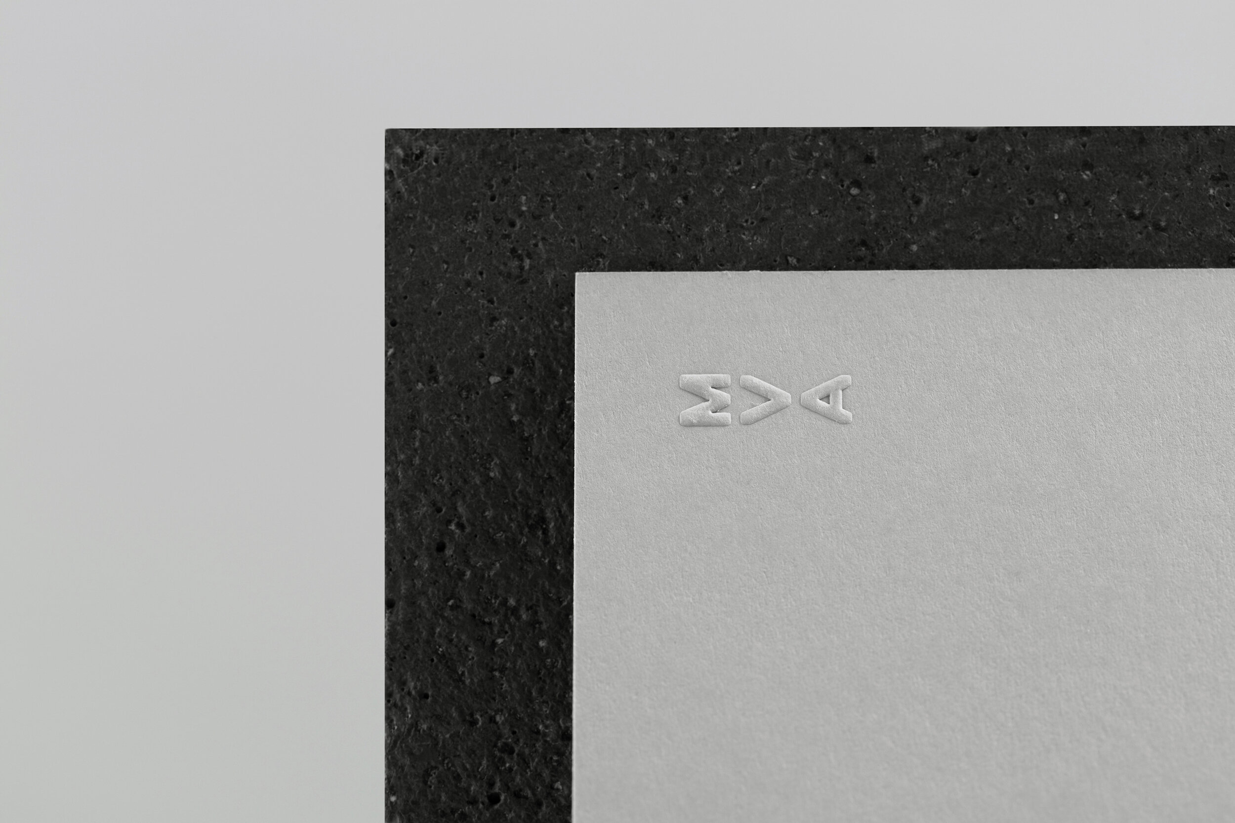
A monolithic symbol and wordmark are complemented with a modernist usage of orange and further developed into a visual language that utilizes typography and space to construct playful patterns and compositions.
Brand Strategy / Visual Identity / Brand Guidelines / Stationery / Print Collateral / Print Production / Website / Photography
Art Director: Mario Depicolzuane
Graphic Designer: Benja Pavlin
Animation: Jovana Đukić


